Brand & Marketing Designer | Branding, Digital & Creative Campaigns

SCD
Branding · Digital · Marcom · Packaging ׀ at Giraff Branding
The challenge was to ensure that these four colors could be used individually and in combination within the same composition, all while maintaining the harmony and modernity of the palette
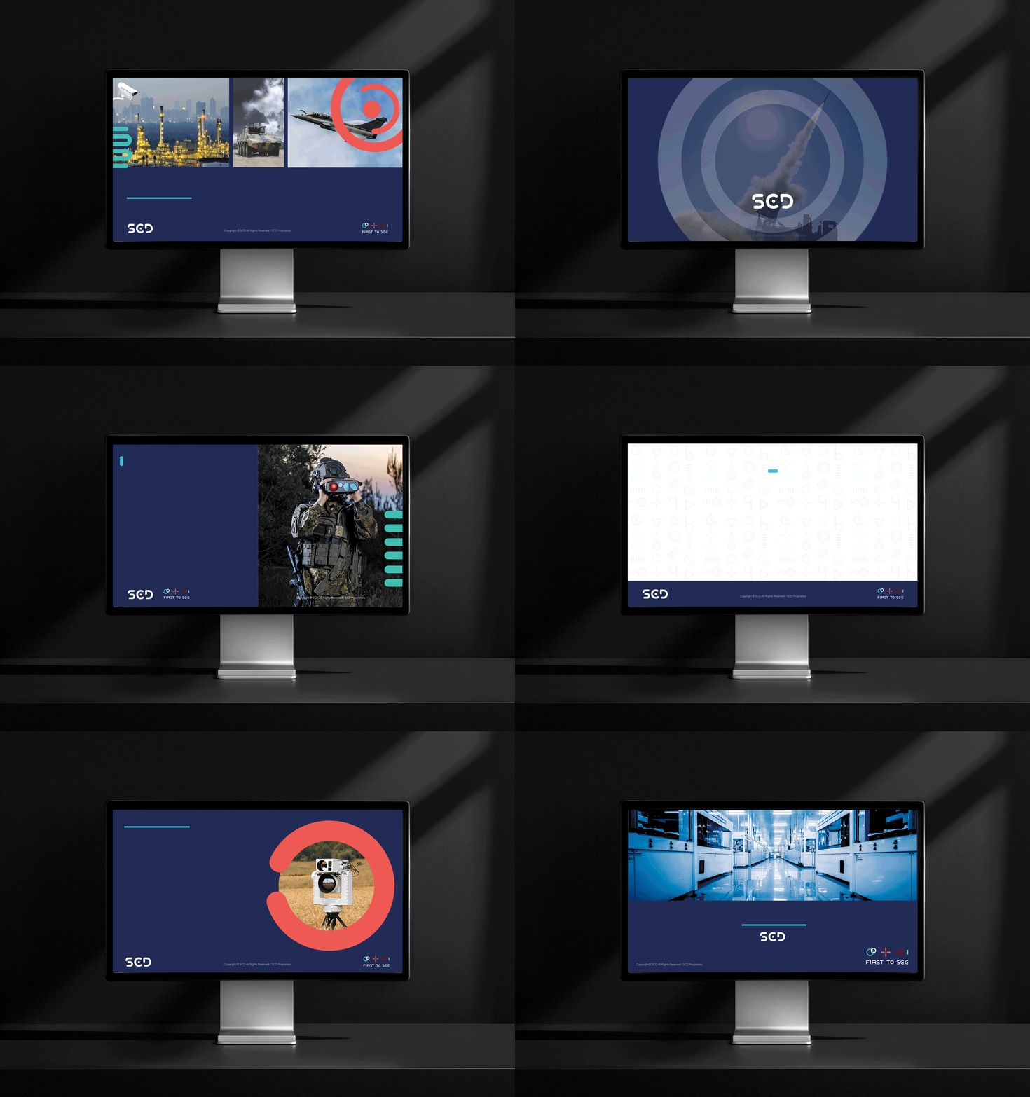
I led a complete makeover of SCD company's look. This involved making a new logo, improving product brochures, designing attractive banners, creating a presentation template, making merchandise, and developing assets for events.

We thoroughly researched SCD's background and the field of electro-optical systems to shape a visual identity that echoed the company's slogan, 'First to See.'
Drawing from electromagnetic spectrum expertise, I designed graphic elements reflecting 'focus' and 'precision,' along with physics-inspired shapes like waves.





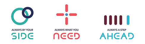
In line with SCD's aspiration to accentuate its innovative and customer-centric image, our strategists introduced three core values: "Always by your side," "Always what you need," and "Always a step ahead."
These values guided my research to understand this evolving mindset. So, I created three icons to efficiently illustrate each value.


SCD serves four key markets, each represented by a unique color: Blue for Commercial, Grey for Space, Green for Defense, and Red for Homeland Security (HLS).
When discussing broader topics, we seamlessly incorporate all four colors.